Exploring Salmon Results
Bruno Grande
2017-06-26
Filtering Genes
First, let’s observe the distribution of the median expression count per gene. Note that there is a long tail, and we’re just focusing on the small medians.
salmon$raw$gene_stats <- get_stats(salmon$raw$counts)

hist_salmon_raw_gene_medians <-
  salmon$raw$gene_stats %>%
  filter(median <= 20) %>%
  ggplot(aes(x = median)) +
  geom_histogram(binwidth = 1, fill = "grey75", colour = "grey40") +
  labs(x = "Median raw expression", y = "Frequency")

hist_salmon_raw_gene_medians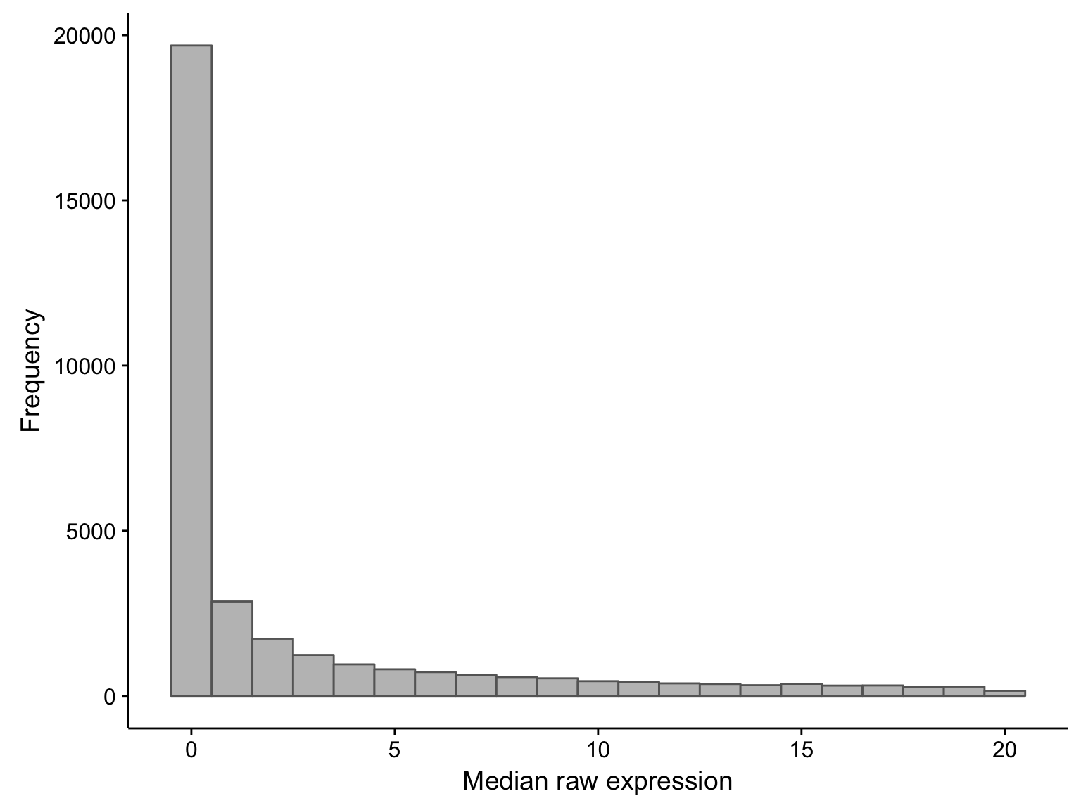
As you can see, there is a large proportion of genes whose expression medians are less than one: this affects 21381 out of 58068 genes. If we were to exclude these median-zero genes, we should first ensure that these genes are not just undetectable in less than half of the samples, but consistently expressed in the rest. To verify this, we plot the average expression of these median-zero genes below.
hist_salmon_raw_gene_means <-
  salmon$raw$gene_stats %>%
  filter(
    median == 0,
    mean <= 10) %>%
  ggplot(aes(x = mean)) +
  geom_histogram(bins = 30, fill = "grey75", colour = "grey40") +
  labs(x = "Mean raw expression", y = "Frequency")

hist_salmon_raw_gene_means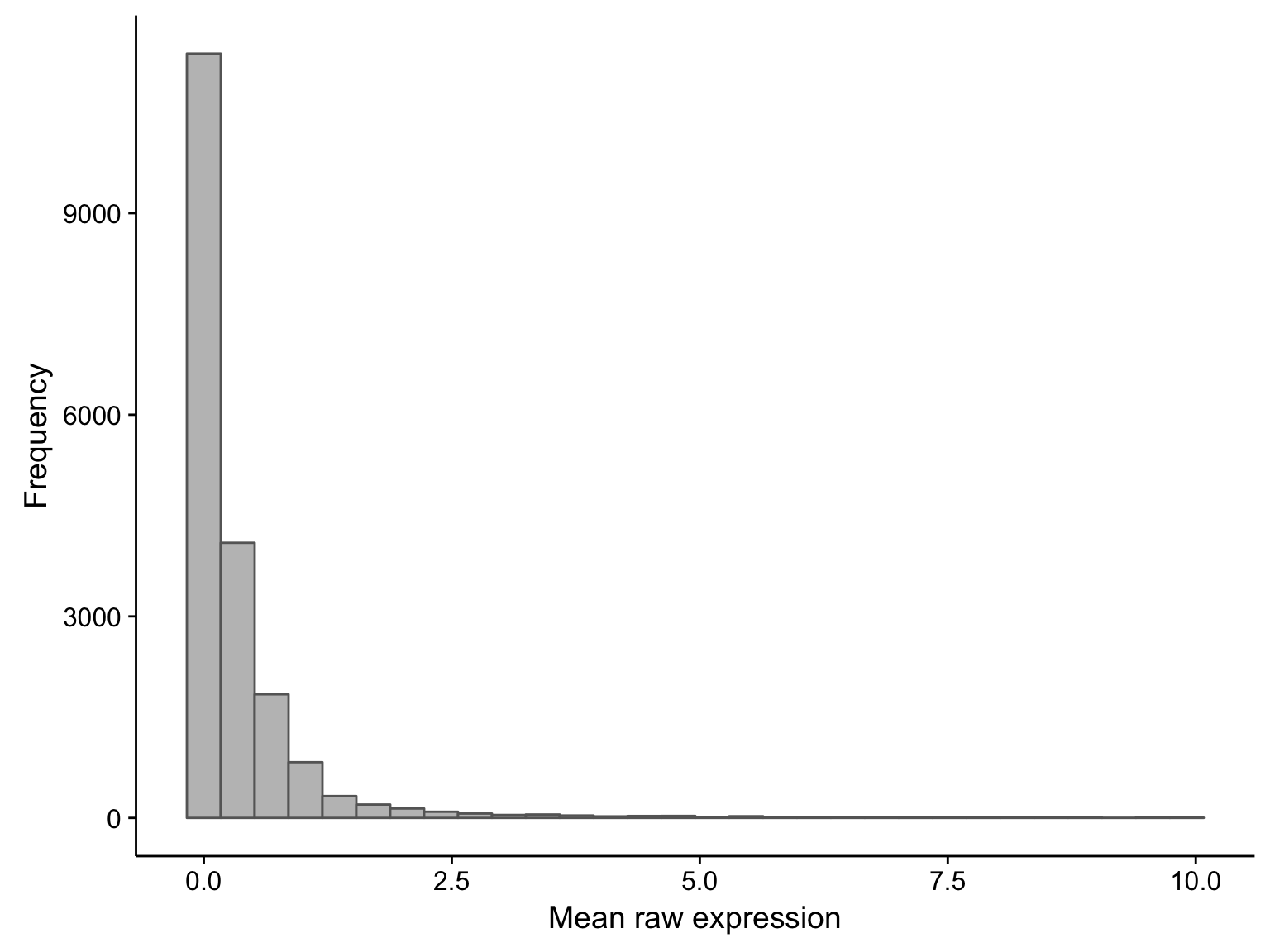
As you can see above, the average expression of these median-zero genes is extremely low for the vast majority: only 153 out of 19326 median-zero genes have an average expression count above five. Let’s plot the expression of these genes to see whether it’s worth rescuing them, i.e. including them despite their median-zero status. Note that I’m scaling the values in each row.
heatmap_salmon_raw_median_zero_high_mean_genes <-
  hist_salmon_raw_gene_means$data %>%
  filter(mean > 5) %$%
  salmon$raw$counts[gene,] %>%
  plot_heatmap(colours, colData(salmon$raw$dds), border_color = NA)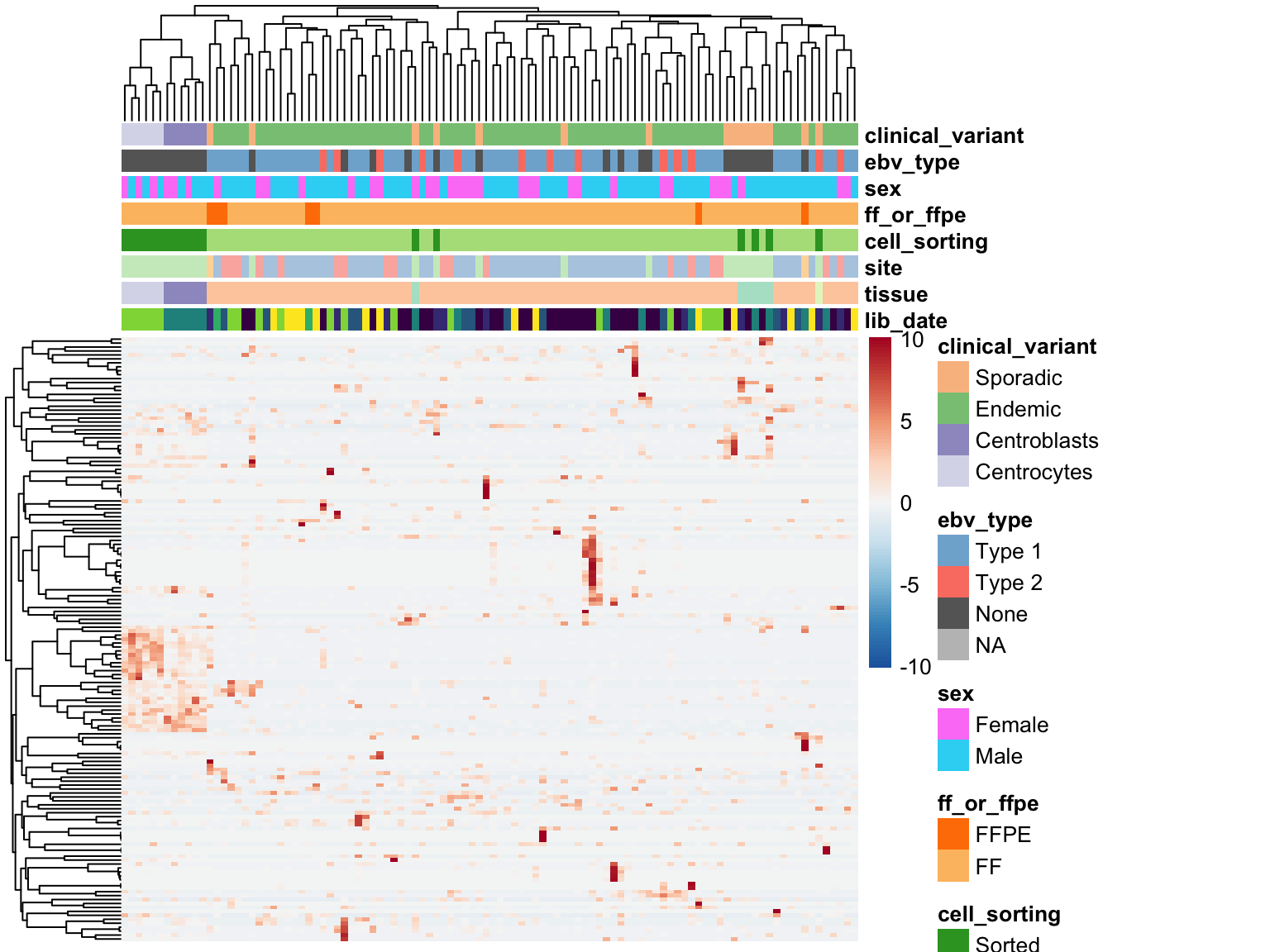
The above heatmap indicates that these genes are indeed outliers that only appear in a few samples. For this reason, these genes will not be rescued. I will now remove all median-zero genes.
genes$no_mz <- salmon$raw$gene_stats$gene[salmon$raw$gene_stats$median > 1]
salmon      <- subset_salmon2(salmon, "no_mz", genes = genes$no_mz)

genes <- purrr::map(genes, ~ .x[.x %in% rownames(salmon$no_mz$counts)])
Variance Stabilizing Transformation
For clustering and visualization, it is useful to transform the heteroscedastic count data such that variance no longer depends on the mean. In other words, we want to perform a variance stabilizing transformation. The DESeq2 package offers a number of functions to achieve this. We plot the relationship between the standard deviation and the mean after performing a vst() transformation to confirm that it is appropriate.
mean_sd_plot_salmon_no_mz_vst <-
  vsn::meanSdPlot(assay(salmon$no_mz$vst), plot = FALSE)$gg +
  labs(x = "Mean (rank)", y = "Standard deviation")

mean_sd_plot_salmon_no_mz_vst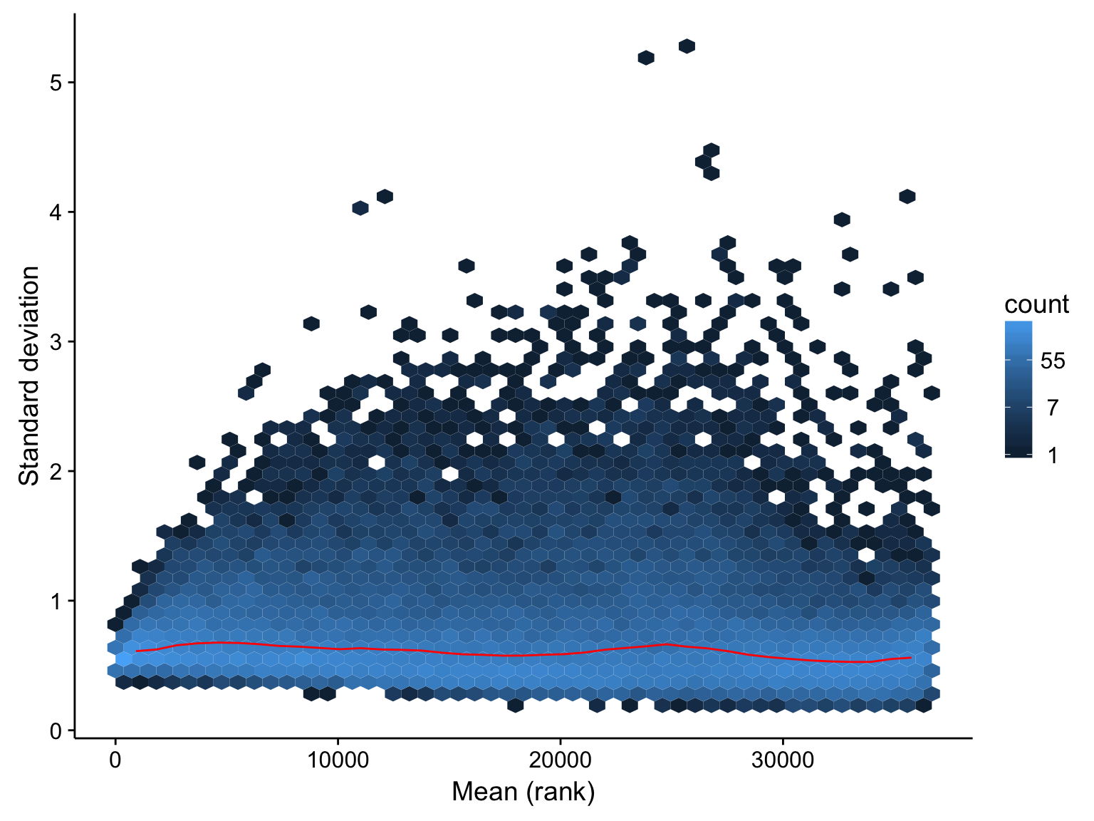
The above plot indicates that the effect of mean on variance has been largely removed across the dynamic range of the expression values. We will proceed with these transformed expression values below.
Filtering Samples
Now that we’ve removed uninformative genes, we should identify any outlier samples that should be excluded from downstream analyses. We will first look at the distribution of gene expression values. Note that we are using transformed (variance-stabilized) expression values.
boxplot_salmon_no_mz_sample_df <-
  assay(salmon$no_mz$vst) %>%
  t() %>%
  as.data.frame() %>%
  rownames_to_column("patient") %>%
  gather(gene, expr, -patient)

boxplot_salmon_no_mz_patient_xorder <-
  boxplot_salmon_no_mz_sample_df %>%
  group_by(patient) %>%
  summarise(median = median(expr)) %>%
  arrange(desc(median)) %$%
  patient

boxplot_salmon_no_mz_sample <-
  annotations %>%
  rownames_to_column("patient") %>%
  select(patient, ff_or_ffpe) %>%
  right_join(boxplot_salmon_no_mz_sample_df, by = "patient") %>%
  ggplot(aes(x = patient, y = expr, fill = ff_or_ffpe)) +
  geom_boxplot(colour = "grey25") +
  scale_x_discrete(limits = boxplot_salmon_no_mz_patient_xorder,
                   labels = NULL) +
  scale_fill_manual(values = colours$ff_or_ffpe) +
  labs(x = "Patient", y = "Transformed expression")

salmon$no_mz$sample_stats <- get_stats(assay(salmon$no_mz$vst),
                                       transpose = TRUE)

wilcox_median_ff_or_ffpe <-
  salmon$no_mz$sample_stats %>%
  left_join(metadata$mrna, by = "patient") %$%
  wilcox.test(median[ff_or_ffpe == "FF"], median[ff_or_ffpe == "FFPE"])

boxplot_salmon_no_mz_sample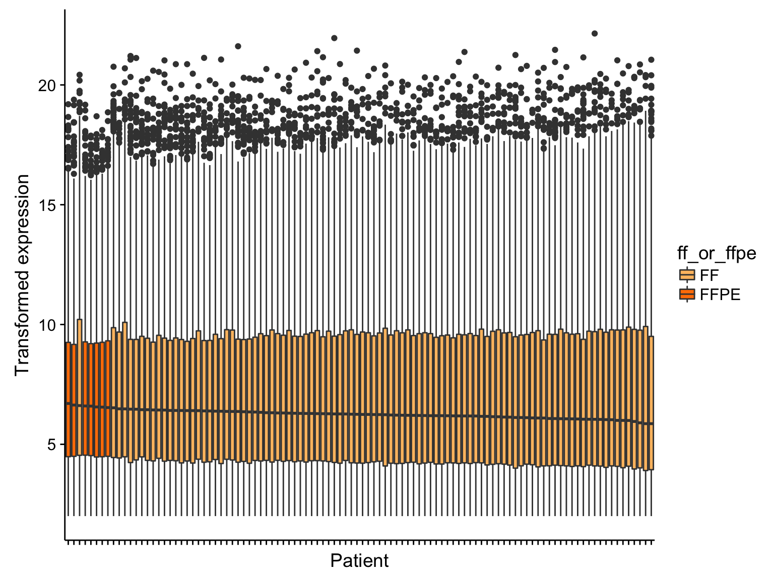
From the boxplots shown above, there doesn’t seem to be extreme outliers in terms of the median expression values. However, the samples with the highest median expression are significantly enriched in FFPE samples (p = 0.0000171, Mann-Whitney-U test). It’s not yet clear whether this is ground for omitting the FFPE samples. If needed, we can correct this FFPE effect. We will wait until we see the results from unsupervised clustering below.
Hierarchical clustering
We perform hierarchical clustering on the 1000 most variably expressed genes. One important parameter to consider is the distance metric for clustering. The most commonly used metrics are the Euclidean distance and the Pearson correlation. Both are plotted below.
heatmap_salmon_no_mz_most_var_euclidean <-
  plot_heatmap(most_var(salmon$no_mz$vst, ntop), colours, main = "Euclidean distance",
               clustering_distance_cols = "euclidean", cutree_cols = 2)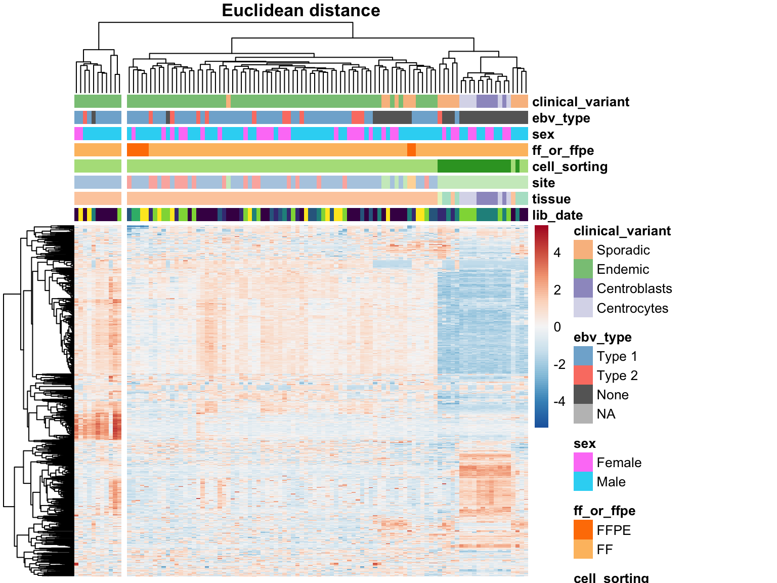
heatmap_salmon_no_mz_most_var_correlation <-
  plot_heatmap(most_var(salmon$no_mz$vst, ntop), colours, main = "Pearson correlation",
               clustering_distance_cols = "correlation", cutree_cols = 2)
The two approaches do not agree on the sample clustering. Specifically, the Euclidean distance highlights an outgroup characterized by extreme expression of a subset of genes. These outlier samples are no longer an outgroup using the Pearson correlation distance metric. Instead, centroblast and centroblast-like samples cluster apart, but probably represent meaningful biological variation and will be included in downstream analyses. The skin-contaminated samples though
Before proceeding, we should understand what constitutes the sample outgroup using Euclidean distance. To get an idea, we can perform gene annotation enrichment analysis on the highly expressed genes that seem to define this cluster. MetaScape reveals the following list of enriched gene annotations.
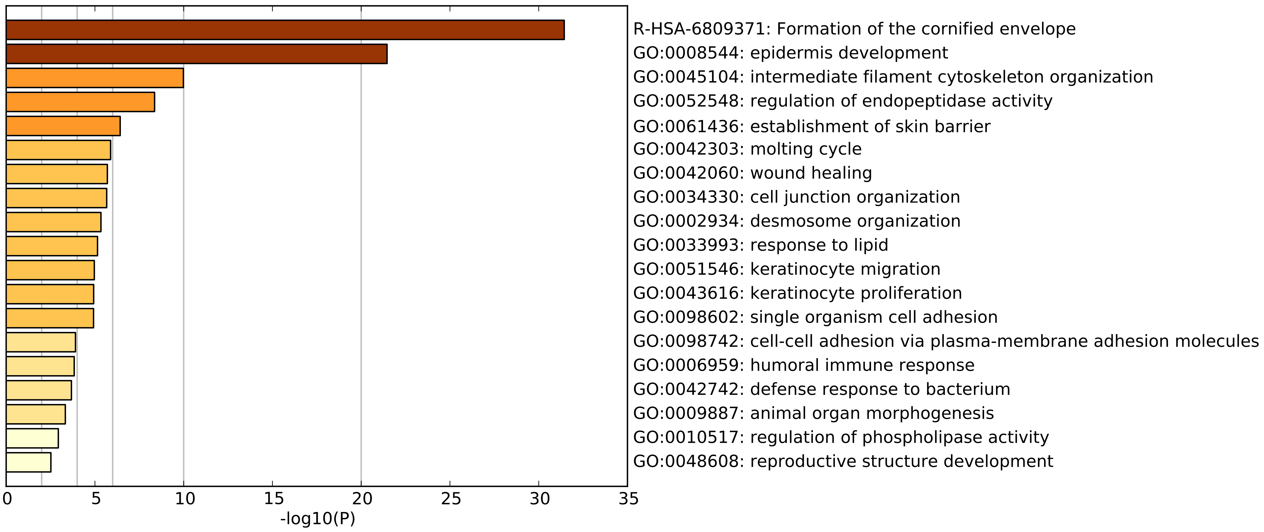
The top two enriched annotations point towards skin tissue involvement. According the GTEx data, these genes are most expressed in oesophageal mucosa and skin tissues. Altogether, this leads us to hypothesize that these samples are contaminated by normal skin tissue. Local pathology review of some of these tissue samples support our hypothesis. Before excluding these samples outright, we will first determine whether we can correct these effects.
contamination    <- cutree(heatmap_salmon_no_mz_most_var_euclidean$tree_col, 2)
contamination_id <- names(contamination %>% table() %>% sort())[1]
contamination    <- as.factor(ifelse(contamination == contamination_id, "Epithelial", "None"))

colData(salmon$no_mz$dds) <-
  colData(salmon$no_mz$dds) %>%
  as.data.frame() %>%
  cbind(contamination = contamination, .) %>%
  select(clinical_variant, ebv_type, sex, ff_or_ffpe, cell_sorting,
         contamination, site, tissue, lib_date) %>%
  as("DataFrame")
Principal component analysis
The first approach to unsupervised clustering is a principal component analysis. This will identify is the major sources of variation (_e.g._PC1, PC2) are explained by technical or biological features. As a sanity check, I also include the scree plot below.
salmon$no_mz$pca <- calc_pca(salmon$no_mz$vst)

pca_salmon_no_mz_plots <-
  names(colData(salmon$no_mz$dds)) %>%
  map(~plot_pca(salmon$no_mz$pca, .x, colours, c(1,1)))

screeplot_salmon <-
  salmon$no_mz$pca$percent_var %>%
  slice(1:10) %>%
  ggplot(aes(x = pc, y = percent_var, group = "all")) +
  geom_point() +
  geom_line() +
  labs(title = "PCA Scree Plot")

# pca_salmon_no_mz_plots <- c(pca_salmon_no_mz_plots, list(screeplot_salmon))

gridExtra::grid.arrange(grobs = pca_salmon_no_mz_plots, ncol = 3)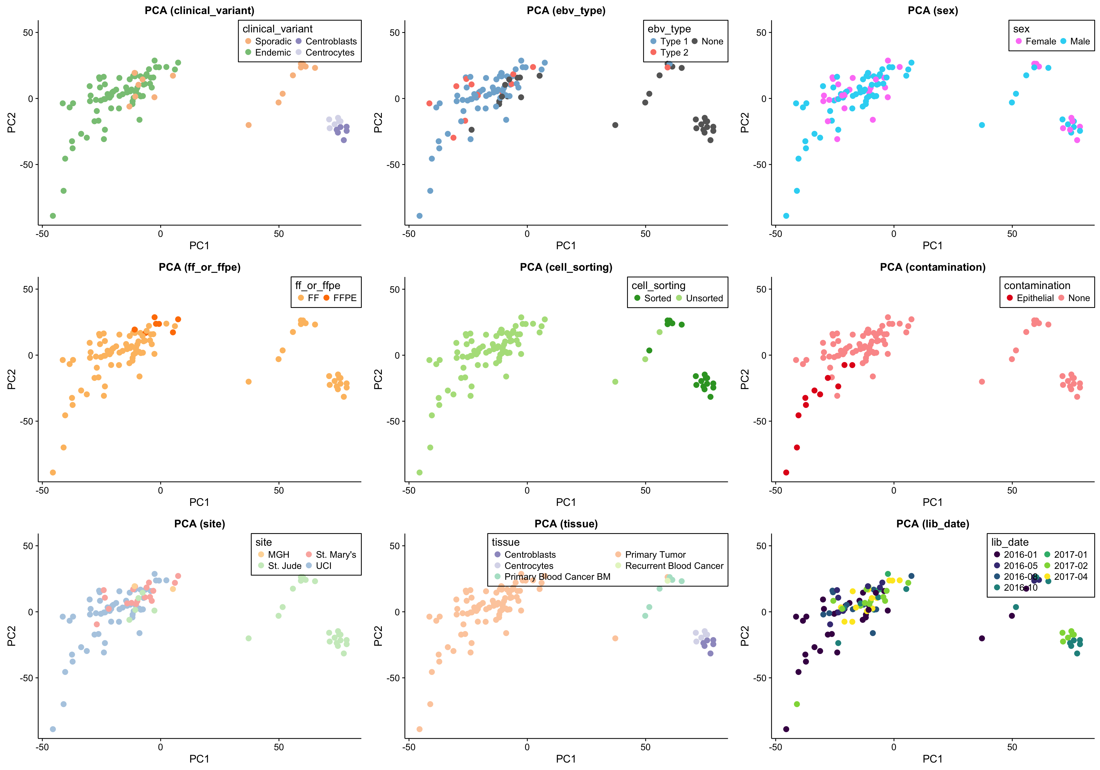
The above set of PCA plots are reassuring for the following reasons:
- There doesn’t seem to be clear clustering according to technical features such as library or sequencing date.
- The normal samples (centroblasts) cluster together, suggesting little variability in the centroblast expression profiles.
- The FFPE samples, while they still cluster together, do not significantly separate themselves from the remaining tumour samples.
Focusing on the tumour samples, there are two clear clusters: a big one and a smaller one. None of the features perfectly account for the separation of the small cluster from the big cluster. Some features come close though and warrant further investigation (e.g. site, EBV status and clinical variant status).
There is a substantial difference between the variance explained by PC1 and PC2, but nothing worrisome.
EBV Gene Expression
Before correcting for batch effects, we first need to determine whether EBV gene expression is consistent within EBV-positive cases. If so, it will be safe to encode EBV status as a binary variable in the DESeq2 model. On the other hand, if EBV gene expression is not consistent (e.g. due to different viral loads), then we will need to consider encoding EBV status as a continuous variable.
ebv_genes_idx <- rownames(salmon$no_mz$vst) %in% ebv_genes

heatmap_salmon_no_mz_ebv_all <-
  salmon$no_mz$vst[ebv_genes_idx,] %>%
  plot_heatmap(colours, scale = "none", cutree_cols = 2,
               clustering_distance_cols = "euclidean")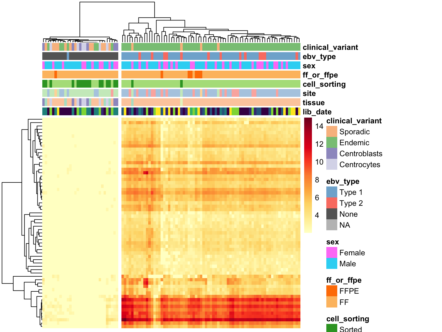
heatmap_salmon_no_mz_ebv_most_var <-
  salmon$no_mz$vst[ebv_genes_idx, cutree(heatmap_salmon_no_mz_ebv_all$tree_col, 2) == 1] %>%
  most_var(30) %>%
  plot_heatmap(colours, clustering_distance_cols = "euclidean")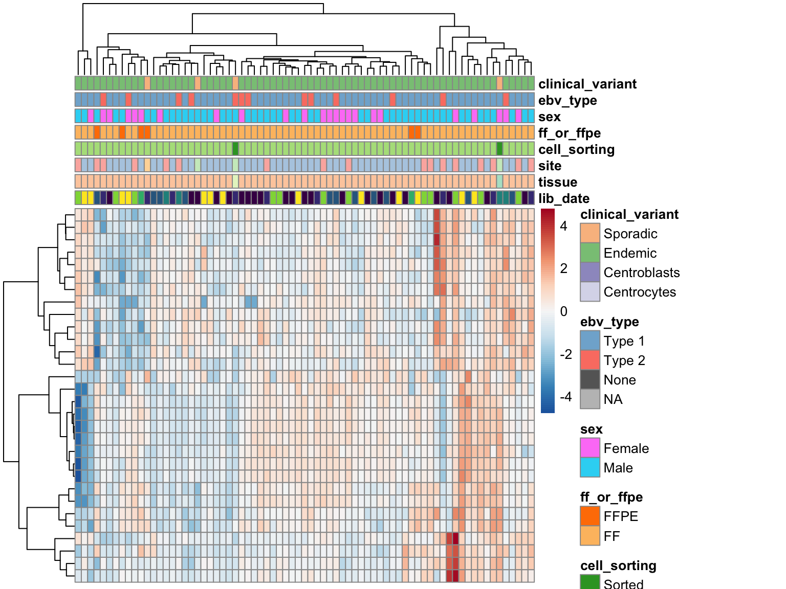
Unsurprisingly, clustering on EBV gene expression perfectly separate samples based on EBV status, with one exception (see discussion below). The heatmap doesn’t show a huge degree of inconsistency among EBV-positive cases, meaning that we can stick with a binary variable for encoding EBV status in the DESeq model.
BL081 is the case with no EBV gene expression despite being labelled as EBV-positive. While EBV reads are detected in this case’s tumour genome, the RNA data seems to have a different profile. In addition to the discrepant EBV status between the RNA and DNA data, somatic mutations are mostly absent (VAF < 1%) in the RNA data. Overall, there seems to be very poor tumour content in the RNA-seq data. For these reasons, we will omit this cases from further analysis.
non_outliers <- colnames(salmon$no_mz$counts)[colnames(salmon$no_mz$counts) != "BL081"]
salmon       <- subset_salmon2(salmon, "clean", "no_mz", genes = genes$no_mz,
                               patients = non_outliers)
Detect Batch Effects
There are multiple approaches to removing batch effects. We wish to do this before performing differential gene expression analysis using DESeq2. Otherwise, these batch effects might lead to a higher false positive rate. Below, we plot the surrogate variables as a function of known features to determine whether they are correlated with them. The colour legend is at the bottom of the figure.
mod0 <- model.matrix(~ sex, colData(salmon$clean$dds))
mod  <- model.matrix(~ sex + ebv_type + clinical_variant,
                     colData(salmon$clean$dds))

num_sv           <- sva::num.sv(salmon$clean$counts, mod, method="be")
salmon$clean$sva <- svaseq_quiet(salmon$clean$counts, mod, mod0, n.sv = num_sv)
sv_names         <- paste0("SV", seq_len(num_sv))
salmon$clean$svs <- as.data.frame(salmon$clean$sva$sv) %>% set_names(sv_names)
covariates <-
colData(salmon$clean$dds) %>%
as.data.frame() %>%
rownames_to_column("patient") %>%
cbind(salmon$clean$svs)
sva_plots <- purrr::map(sv_names, ~ make_sva_plot(covariates, .x))
sva_legend <- "Blue colour, Bonferroni q-value < 0.01 (Kruskal-Wallis Test)"
gridExtra::grid.arrange(grobs = sva_plots, ncol = num_sv, bottom = sva_legend)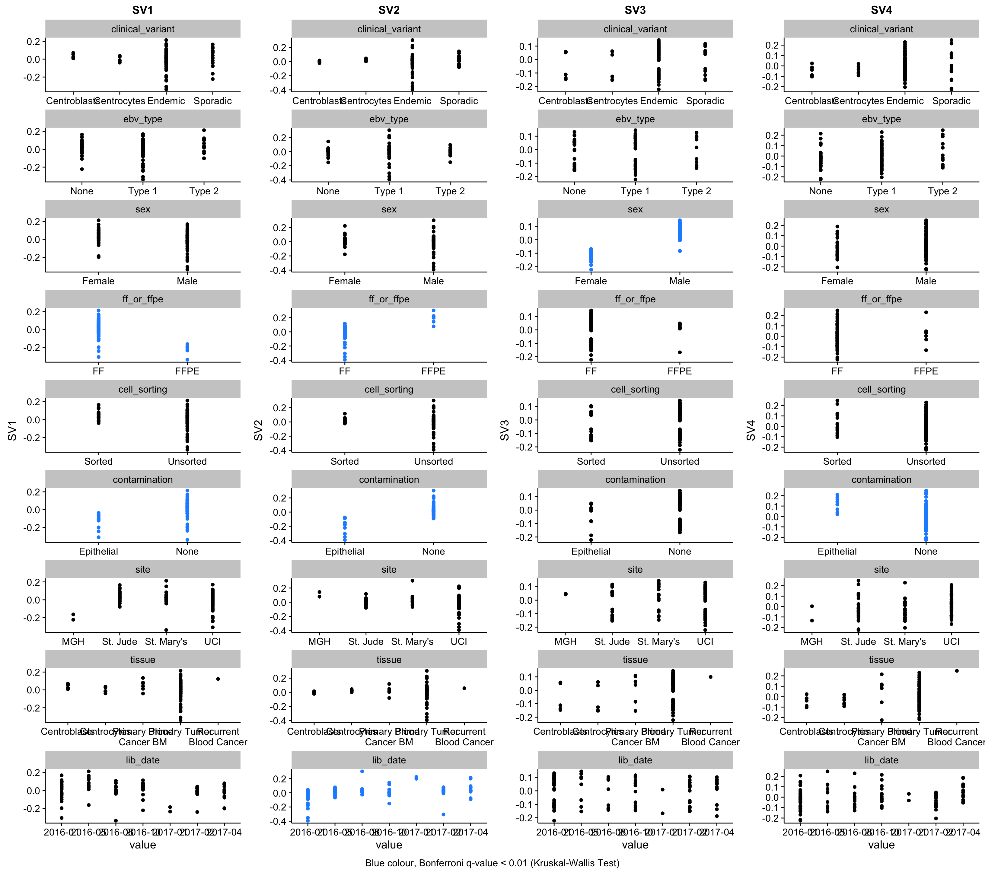
The method estimated that 4 surrogate variables are needed to capture latent effects in the data.
SV1 (first surrogate variable) is strongly correlated with FF/FFPE status. It is also correlated with the library construction date, most likely due to the fact that we only started receiving FFPE samples later during the project. In fact, you can see this trend in the plot whereby SV1 decreases over time (lid_date).
SV2 is strongly correlated with the skin contamination described earlier. Pleasingly, the patient with the highest value for SV2, BL042 is the one with the most striking levels of contamination based on the above heatmaps. SV2 is also correlated with sex, which can be accounted for by the fact that most contaminated samples come from males.
SV3 is also correlated with skin contamination but in the other direction. Although, unlike SV2, it is not correlated with sex.
We obviously want to account for these effects when performing differential gene expression analysis. All three surrogate variables correlate with known covariates. Hence, we have the option to either use the binarized factor (i.e. skin or no skin, FF or FFPE) or the continuous variable (the surrogate variables). Because the effect of FF/FFPE status and skin contamination are both inconsistent (i.e. different effect magnitudes), it would be better to encode these problematic variables as continuous. Because we are not interested in performing differential gene expression analysis for these factors, we do not need to stick with binarized variables to ease interpretability.
colData(salmon$clean$dds) <-
  covariates %>%
  select(-lib_date) %>%
  column_to_rownames("patient") %>%
  as("DataFrame")

colData(salmon$clean$vst) <- colData(salmon$clean$dds)
Below is the final DESeq design that will be used for differential gene expression analysis.
deseq_design <- formula(~ sex + SV1 + SV2 + SV3 + ebv_type + clinical_variant)Batch Effect Correction
To investigate unsupervised clustering, we will perform batch effect correction based on the variables defined on the Salmon QC page. Specifically, we correct the variance-stabilized expression values using sex, SV1, SV2 and SV3 as batch variables.
cov_matrix <- as.matrix(colData(salmon$clean$dds)[,c("SV1", "SV2", "SV3")])

salmon$clean$cvst <-
  limma::removeBatchEffect(
    assay(salmon$clean$vst),
    colData(salmon$clean$dds)$sex,
    covariates = cov_matrix) %>%
  SummarizedExperiment(colData = colData(salmon$clean$vst))