Data Exploration
Bruno Grande
2017-02-18 13:33:39
I’m going to explore the data a bit to ensure everything looks good before beginning any analyses.
Lymph2Cx COO status
According to the Lymph2Cx assay, about half of the DLC samples are GCB DLBCL, a little less than one third are ABC DLBCL, and the rest are either unclassifed (“UNC”) or undefined (“NA”).
barplot_coo_ns <-
  coo %>%
  dplyr::count(coo_ns) %>%
  ggplot(aes(x = coo_ns, y = n, fill = coo_ns, label = n)) +
  geom_bar(stat = "identity", colour = "black") +
  scale_fill_manual(values = colours$coo, breaks = NULL) +
  geom_text(y = 0, vjust = -0.5, size = 8) +
  labs(title = "COO assignments by Lymph2Cx assay",
       x = "COO (Lymph2Cx)", y = "Count")

barplot_coo_ns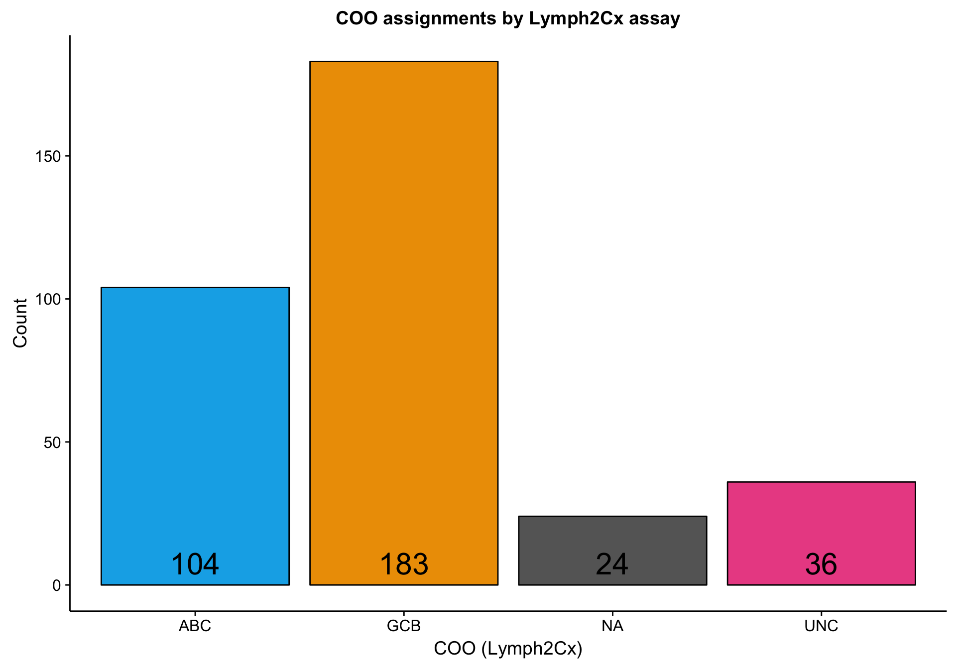
RNA-seq data
Raw expression counts
The RNA-seq dataset includes 322 patients and 23393 genes. Below is a simple scatter plot showing the expected correlation between the mean gene expression across samples and the standard deviation. I’m labelling the most extreme genes to see if any outliers should be excluded. However, I don’t notice any.
expr_gene_stats <- get_stats(expr, genes, "gene")

scatterplot_expr_gene_mean_sd <-
  expr_gene_stats %>%
  ggplot(aes(x = mean, y = sd, label = gene)) +
  geom_point(size = 1, alpha = 0.5) +
  geom_smooth(method = lm, fullrange = TRUE) +
  ggrepel::geom_label_repel(data = dplyr::filter(expr_gene_stats, mean > 45000 | sd > 25000)) +
  labs(title = "Mean and SD of expression counts per gene",
       x = "Mean", y = "SD")

scatterplot_expr_gene_mean_sd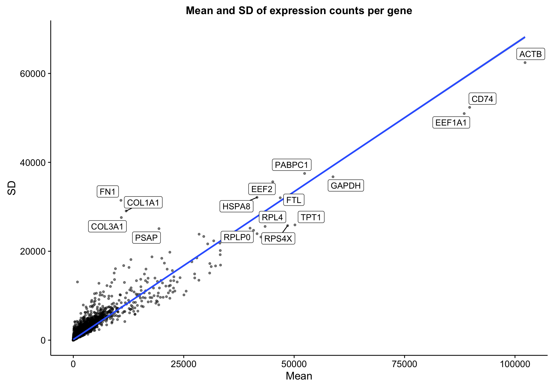
There are 7893 genes with a median expression of 0 across the cohort.
hist_gene_median <-
  expr_gene_stats %>%
  dplyr::filter(median <= 10) %>%
  ggplot2::ggplot(aes(x = median)) +
  geom_histogram(bins = 11, colour = "black") +
  scale_x_continuous(breaks = 0:10) +
  labs(title = "Median expression counts per gene\n(Not all data shown)",
       x = "Median", y = "Frequency")

hist_gene_median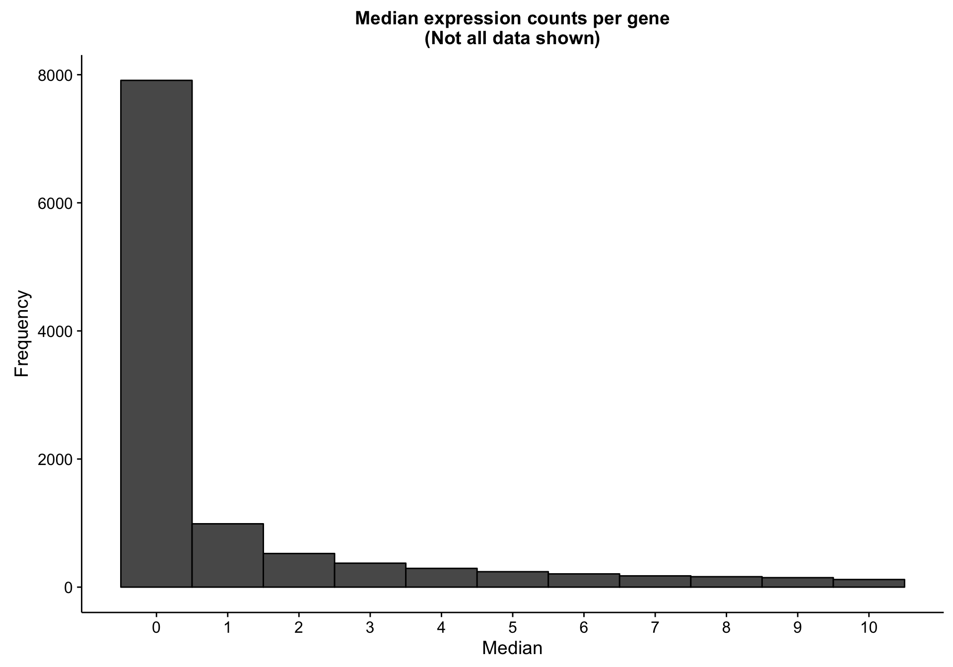
These lowly expressed genes are omitted from downstream analyses, as they offer little signal.
median_filter <- matrixStats::rowMedians(expr) >= 1
expr_filt <- expr[median_filter, ]
gene_ids_filt <- gene_ids$rnaseq[median_filter]
genes_filt <- genes[median_filter]
genes_df_filt <- genes_df[median_filter, ]
I’m doing the same scatter plot, but with patients (columns) instead of genes (rows). Once again, there doesn’t seem to be any obvious outliers. The large variation in mean expression is something to keep in mind though. Notably, this obviously justifies library size correction.
expr_patient_stats <-
  get_stats(expr_filt, patients$rnaseq, "patient", transpose = TRUE) %>%
  dplyr::inner_join(coo, by = "patient")

scatterplot_expr_patient_mean_sd <-
  expr_patient_stats %>%
  ggplot2::ggplot(aes(x = mean, y = sd, label = patient, colour = coo_ns)) +
  geom_point(data = dplyr::select(expr_patient_stats, -coo_ns),
             size = 2, colour = "grey", alpha = 0.5) +
  geom_point(size = 2) +
  facet_wrap(~coo_ns) +
  scale_colour_manual(values = colours$coo, breaks = NULL) +
  labs(title = "Mean and SD of expression counts per sample",
       x = "Mean", y = "SD")

scatterplot_expr_patient_mean_sd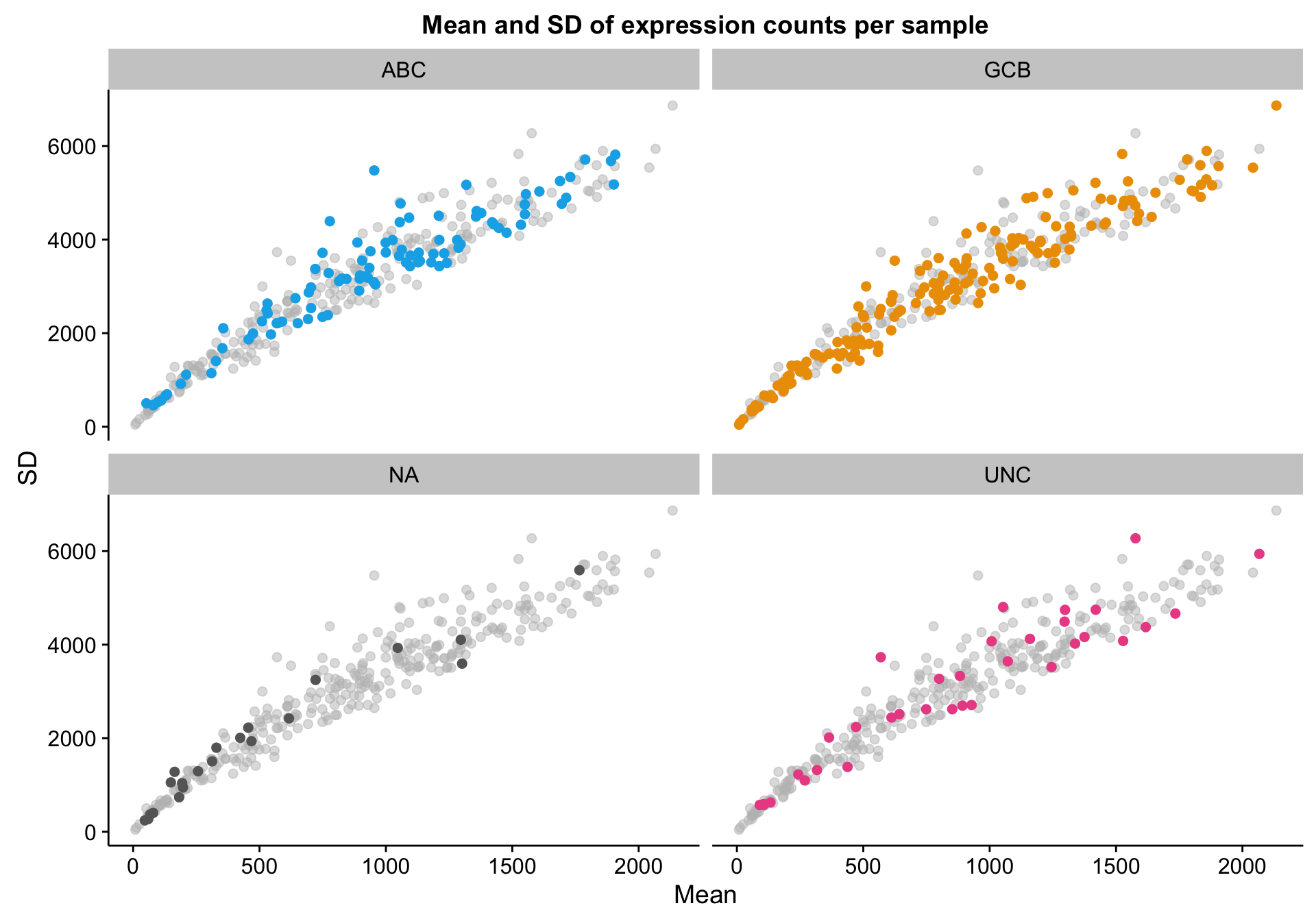
Based on the scatter plot above, I noticed a pattern where samples with “NA” COO status seem to have lower mean gene expression. Indeed, based on the violin plot below, compared to the three other COO categories, the “NA” status shows a distribution shifted towards lower gene expression. It’s not yet clear whether these lower values are caused by lower tumour content or smaller library sizes.
violinplot_patient_mean <-
  expr_patient_stats %>%
  ggplot2::ggplot(aes(x = coo_ns, y = mean, fill = coo_ns)) +
  geom_violin() +
  scale_fill_manual(values = colours$coo, name = NULL, breaks = NULL) +
  labs(title = "Mean expression count per sample\nSplit by Lymph2Cx COO status",
       x = "COO (Lymph2Cx)", y = "Mean expression count")

violinplot_patient_mean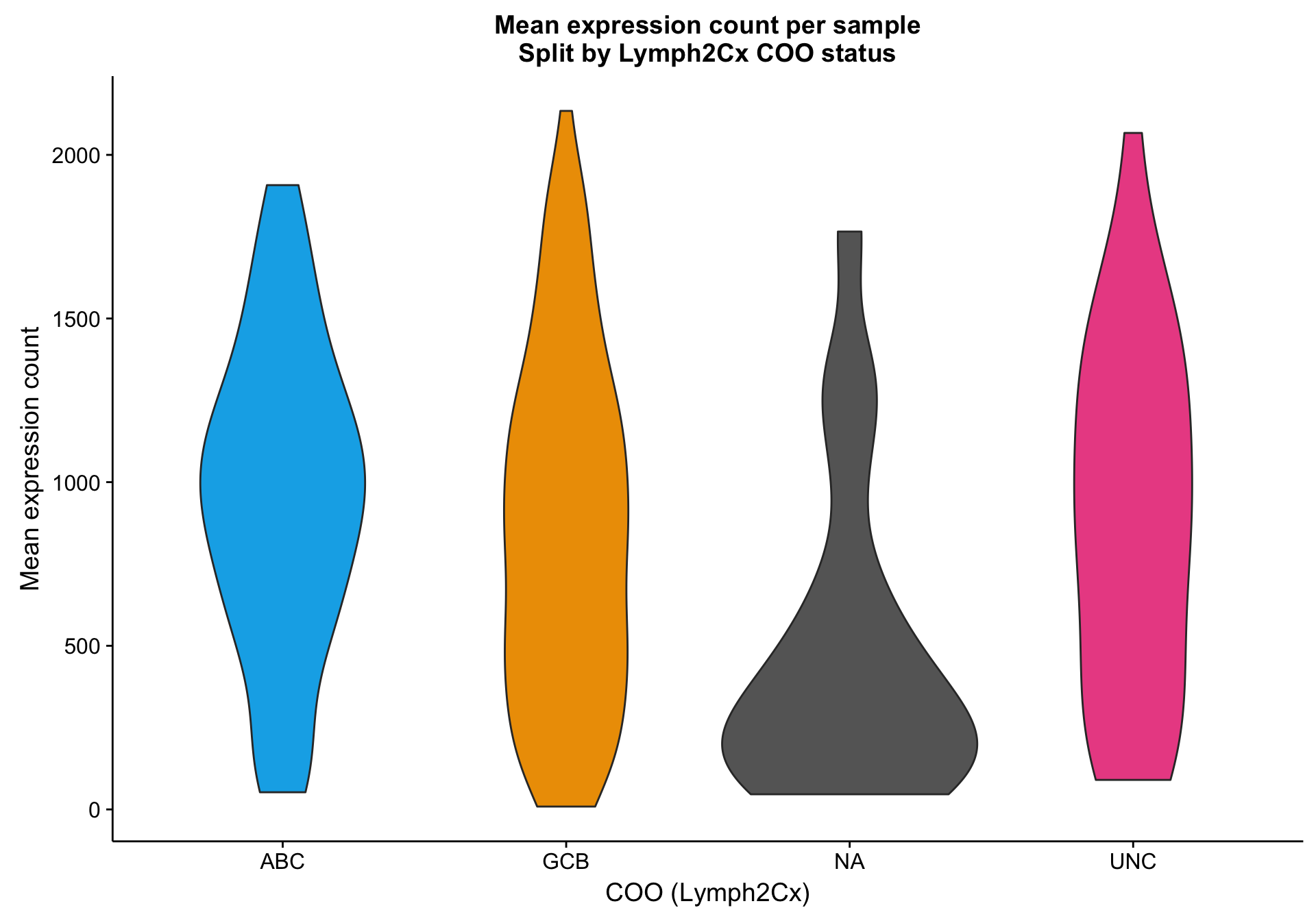
One way to investigate the hypothesis that the lower mean expression is due to tumour content is to look at tumour/normal tissue content estimates. There are many ways to obtain these, but one readily available source are the OncoSNP estimates. Below, I’m plotting the normal content estimates according to COO status. It’s not clear whether the NA cases have a relatively higher normal content compared to the other samples.
violinplot_nc <-
  coo %>%
  dplyr::inner_join(nc) %>%
  dplyr::filter(!is.na(nc)) %>%
  ggplot2::ggplot(aes(x = coo_ns, y = nc, fill = coo_ns)) +
  geom_violin() +
  scale_fill_manual(values = colours$coo, name = NULL, breaks = NULL) +
  labs(title = paste0("Normal tissue content per sample\n",
                      "Split by Lymph2Cx COO status"),
       x = "COO (Lymph2Cx)", y = "Normal content")
violinplot_nc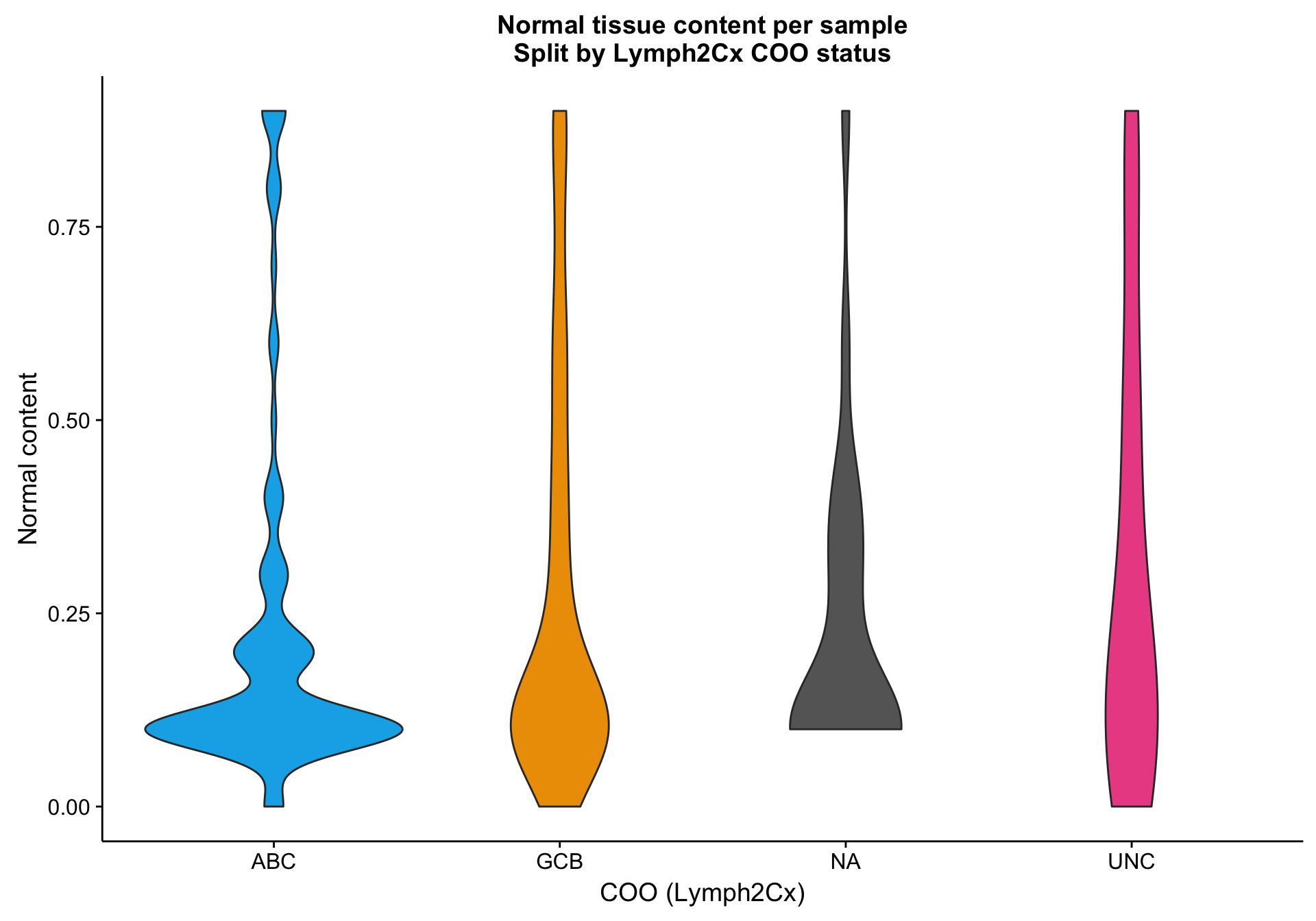
Transformed expression values
The exploratory analysis of the raw expression counts above does not raise any major concerns. The next step in the analysis of the RNA-seq data is to correct the expression counts for library size and somehow normalize the values to minimize the dependence of variance on mean. We use DESeq2 for both of these tasks.
col_data <-
  coo %>%
  dplyr::filter(patient %in% colnames(expr_filt)) %>%
  dplyr::mutate_at(c("coo_ns"), "as.factor")

dds <- DESeq2::DESeqDataSetFromMatrix(countData = expr_filt, colData = col_data, ~coo_ns)
This data.table install has not detected OpenMP support. It will work but slower in single threaded mode.tdds <- DESeq2::vst(dds)
texpr <- SummarizedExperiment::assay(tdds) %>% set_rownames(genes_filt)
texpr_gene_stats <- get_stats(texpr, genes_filt, "gene")
texpr_patient_stats <- get_stats(texpr, patients$rnaseq, "patient", transpose = TRUE)Here, I’m doing a quick check of the library size factors to look for any outliers. It seems that the size factors are relatively uniformly distributed for every COO status, except for perhaps the “NA” status. This probably reflects the generally lower gene expression for “NA” samples. If the lower gene expression is caused by smaller library sizes, then all is good. However, if the lower gene expression is caused by low tumour content—which could also explain the undefined (“NA”) status of these samples—this could be a source of noise or bias.
size_factors <-
  SummarizedExperiment::colData(tdds) %>%
  as.data.frame()

hist_size_factors <-
  size_factors %>%
  ggplot2::ggplot(aes(x = sizeFactor, fill = coo_ns)) +
  geom_histogram(data = dplyr::select(size_factors, -coo_ns),
                 bins = 30, fill = "grey", alpha = 0.5) +
  geom_histogram(bins = 30, colour = "black") +
  facet_wrap(~coo_ns) +
  scale_fill_manual(values = colours$coo, breaks = NULL)

hist_size_factors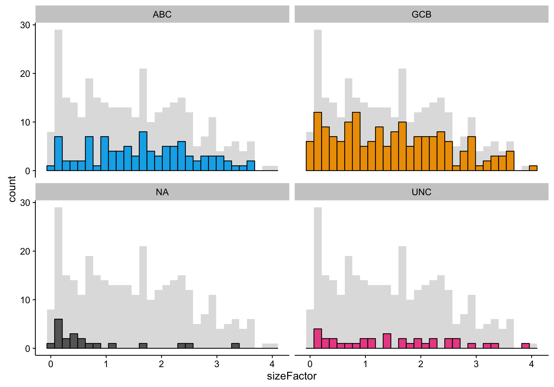
Mutation data
The mutation dataset is from a targeted sequencing experiment of a panel of lymphoma-related genes. Therefore, we aren’t expecting many mutations per patient. The histograms below show that the mutation load (number of mutations per patient) follows a right-skewed normal distribution centred around ~12-15 mutations per patient. There is no noticeable change in distribution as a function of COO status.
mut_load <- muts %>%
  dplyr::count(patient) %>%
  dplyr::left_join(coo, by = "patient")
mut_load_no_coo <- dplyr::select(mut_load, -coo_ns)

hist_mut_load <-
  mut_load %>%
  ggplot2::ggplot(aes(x = n, fill = coo_ns)) +
  geom_histogram(data = mut_load_no_coo, fill = "grey", bins = 30, alpha = 0.5) +
  geom_histogram(bins = 30, colour = "black") +
  scale_fill_manual(values = colours$coo, breaks = NULL) +
  facet_wrap(~coo_ns) +
  labs(title = "Distribution of mutation load per patient",
       x = "Number of mutations per patient", y = "Frequency")

hist_mut_load